Leading Canadian Immigration Experts
——— Brand Strategy & Identity Refresh ———

J. Kenney Consulting—Canadian Immigration Specialists
Joe Kenney, the principle of J Kenney Consulting was referred to me from my past client. Joe came to me wanting a new website, one that would present his offerings in a professional manner to reflect an image of quality care & depth of expertise — he needed the site to communicate his teams depth of experience & qualifications.
Upon meeting and hearing their Joe's story and the reasons behind what drives their pursuit to help others in need — I knew that there was so much more to their depth of expertise, that needed to be told. So I presented the opportunity to refresh the JKC brand strategy, messaging, identity and website in order to truly embody the firm's position as caring, respected industry experts and thought-leaders.
Brand Strategy
Internal Analysis
Competitor Analysis
Customer Analysis
Perceptual Mapping
Messaging Audit
Content Inventory
Art Direction
Visual Language
Core Themes
Design Cues
Image Direction
Perception, Tone, Voice
Brand Identity
Brand Roadmap
Brand Icons
Core Messages
Logomark
Logotype
Visual System
Digital Presense
Info Architecture
Copy Direction
Wordpress Development
Digital Typography
Multi-lingual Translation
How do we create a cohesive verbal and visual system, for the firm to communicate their evolved brand positioning?
How do we refresh the brand identity to embody the firm as the trusted-leaders and expertise-backed professionals, who care deeply about your case?
How do we express a remarkably sincere level of caring, integrity and trustworthiness?
AudienceSeeking to advance career and education in Canada. Desire a higher quality of life, greater personal freedom, and improved access to opportunities in Canada.
CompetitorsSmall teams who provide high level of service but have less depth of understanding of the law. Larger law firms who know the law, but provide a lower quality of care.
PerceptionEmpathic care. Honest integrity. Expert authority. Uncompromising ethics. Ability to perform and deliver on the value proposed. Positive associations with Federal Gov.
ToneSecure and trustworthiness rooted in honesty and integrity. Un-compromised, clear and direct. Human kind and compassion. Free access to choose your home.
ImageSmart, progressive and Western. Active and abundance. Friendly, natural, and transparent. Rational, precise and composed. Pure and Simple.
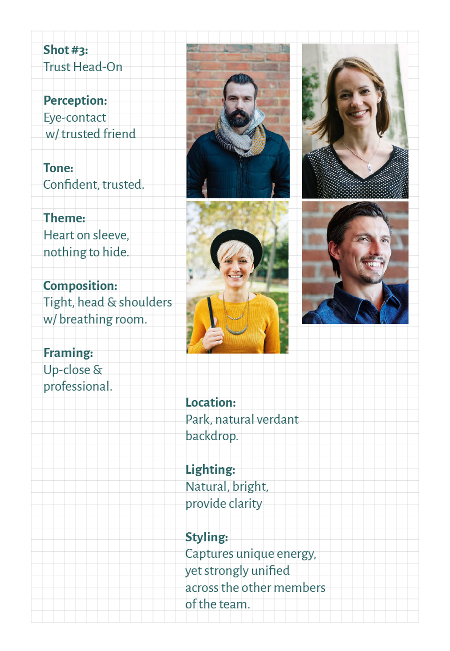
VisualsRefresh typography, and create new brand mark, emblematic of the audience's journey. Produce high-quality staff-photography to connect — the team member are the icons.
PersonalityCaring, trustworthy and loyal advocate — who will champion your case until successful completion, and treat you like one of the family.
MessageEvolve from talking about our services and expertise, towards focus on speaking to the goals & challenges of the audience.
StoryTrusted, experienced, and caring. Depth of care matched only by depth of experience.
INTERNAL ANALYSIS
How well do we know ourselves; our origins; our own strengths and weaknesses? — Who are we?— What do we do?— How do we do it?— Why do we do it?
Communication Audit
We begin with a full communication audit of internal and external messaging, how are we framing our offerings, how are we speaking to our level of care and expertise, what are the benefits promised and how do we deliver on that value?

Legacy Brand Identity & Website
Working closely with Joe was a pleasure, we would flow through Q&A's, and he was able to pull from decades of experience and customer cases. We developed several profiles within each audience B2C and B2B.
Brand Heritage
We wanted to bring forth the principled ethos and icons of the JKC brand, being Joe and his team, and their deep knowledge of the Canadian immigration system. The legacy was only part of the story, it was more importantly about their care & advocacy they provide towards securing their client's future in the country.
Key Insights:
Messaging could be improved moving towards a more customer-centric frame-of-reference. We should shift from speaking about "our offerings, ... our expertise, ... our services" describing the solution from the perspective of the firm — towards selling from the perspective of the audience, and how working with the brand will provide value towards solving their greatest problem.
EXTERNAL ANALYSIS
How do we know the industry & category, the relationship with our audience, the relevant competitors, and the overall landscape? — Who's the audience?— Why is it important to them?— Who's the competition?— What are they saying?— How do they deliver on it?— What is the look & feel of landscape?
Customer Research
Working closely with Joe was a pleasure, we would flow through Q&A's, and he was able to pull from decades of experience and customer cases. We developed several profiles within each audience B2C and B2B.
Who are they?What do they want?Why is it important (to them)?What is their greatest fear?What do they aspire to become?

Age: 35Gender: MaleOccupation: Digital ArtistCountry of Origin: U.SSpecific Media Exposure: Netflix, Facebook, Wired, online gamingActivities: IT based, outdoor (skiing, hiking)Description: Well-educated, highly skilled, well paid, mobile, career-focusedOther Relevant Characteristics: fluent in English, white, Christian or atheist, liberalAspirations: (for Immigrating or otherwise): Have a family in Vancouver. See career advance.

Age: 26Gender: FemaleOccupation: Administrative AssistantCountry of Origin: ChinaSpecific Media Exposure: Online, ethnic media (Chinese), Ming Pao, Weibo, WeChat, Chinese chat sitesActivities: Cooking, eating out, traveling,Description: introverted, Obsessive-compulsive, suspicious of authority,Other Relevant Characteristics:Atheist, apolitical, traditional, middle class,Aspirations (for Immigrating or otherwise):Immigration-focused, seeking to have family in Canada, advance career with further education

Age: 31Gender: femaleOccupation: CookCountry of Origin: JapanSpecific Media Exposure: Japanese media online, chat sites, Oops, ShinpoActivities: Cooking, eating out in large groups, socializing with co-workers, traveling,Description: Quiet among strangers but friendly among friends and acquaintances.Other Relevant Characteristics: Limited English ability, apolitical, buddhist,Aspirations (for Immigrating or otherwise):Immigration to Canada represents liberation. Seeking greater personal freedom and acceptance in Canada

Age: 33Gender: maleOccupation: technical director in filmCountry of Origin: AustraliaSpecific Media Exposure: Australian cultural national media, social media,Activities: Climbing, traveling for work, socializing with co-workers.Description: Outgoing, friendly, natural among friends and acquaintances. Photography is hobby. Family focused.Other Relevant Characteristics: freeman, seeking permanent residence for career opportunities.Aspirations (for Immigrating or otherwise):Immigration to Canada represents freedom to pursue dreams.
Key Findings:
Those seeking liberation & freedom, to access the opportunities to advance oneself, both personally and professionally. Wishing to be judged by their skills & abilities, and the content of their character.
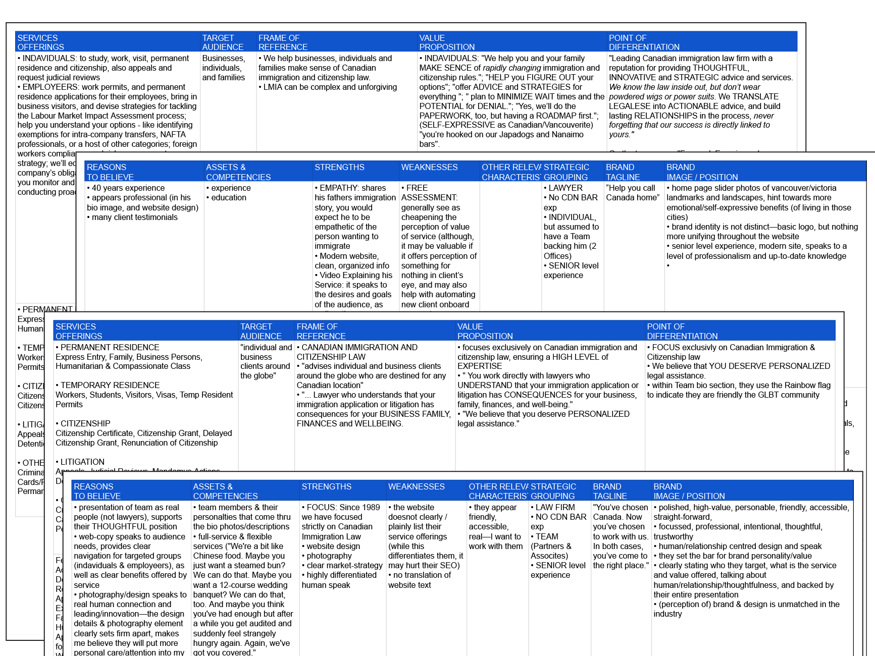
Competitor Research & Analysis
We investigated more than 35 competing firms and service providers within the Canadian Immigration space. The "characteristics of interest" that we would focus on in our research, included:
service offeringstarget audiencevalue-propositionframe-of-referencepoint of differentiation
reasons to believeassets & competenciesstrengths & weaknessestagline & image
Competitive & Category Landscape
Pulling from all 35+ competitors in the market, we were able to understand key strategic groups, and gain a sense for a greater overall impression, with colour, type, icon and photography — we behold the look & feel of the industry.

Key Insights:
Nº 1
Human-Factor
Based on the research, I am seeing an undeniable (perceptual) strength & advantage gained by those firms who speak to the “human” connection factor in their brand image and design / communications. So significant is the brand-customer relationship in this industry—which is rooted in human-connection—I believe that this human-factor can play a superior role, even trumping expertise, in terms of presenting the firm as being a desirable/trusted immigration consulting partner. We see this in the fact that the team and individual team members (and their unique characteristics) have been consistently seen as a discernible strength of any firm. This is reinforced by the fact that in service brands, the individual human delivering the service, is seen as the embodiment of the brand (in the mind of the audience).
Nº 2
Design Details
Design allows us to speak directly & clearly to an audience; connect with them on a rational & emotional level, to help them understand and make them feel understood; allows them to assess whether or not the brand/company/individual is there “type”; as well as most importantly be representative to the high- or low-value in an intangible service. The research reinforces that fact that, there will always be a direct connection between the presentation of the brand / information and the quality associated with it. The clear, organized, easily comprehensible design of communications related to such a complex & confusing process, will always directly impart a feeling or understanding on the audience, making them believe that the firm will help them make sense of their application, and present their case in a professional and successful manner. Professional, detail-oriented design translates into the perception of being professional and detail-oriented, and so on.
Brand Roadmap
Based on the brand truths uncovered and insights illuminated during the internal analysis, next we work to distill the core brand messages, which would lay the foundation for defining the brand strategy.
— What's the Big Idea?— What is Your Cause Greater than Self?— What Makes You Different & Better?— What Is the True Value Your Offer?
I engaged Joe and his team in strategy exercise & conversation, where I asked the right questions, which allowed him and his team to reflect and dig deeper to discover their own brand truths and story. We uncovered, distilled and defined the Core Brand Concept and Differentiation, the ideology which forms the foundation of the brand strategy.
BRAND CONCEPT
“We Care About Your Success.”
CORE PURPOSE
“We help you access the freedom and opportunity needed to achieve your goals in life and career.”
Through discussion and exercise I helped Joe understand the strategic framework, within which we were are able articulate his vision; the Core Brand Purpose and Core Values, the ideology which are the pillars of the brand.
CORE VALUES
1
True Empathetic Care.
2
Inherent Honesty.
3
Complete Competence.
4
Integrity For All.
BRAND PROMISE
“We provide in-depth service, expertise and advocacy throughout your immigration journey — lifting the burden of stress and uncertainty involved in obtaining permanent or temporary status in Canada.”
BRAND MISSION
“We help organizations, individuals, and families make sense of the Canadian immigration system.”
BRAND ESSENCE
“Advocacy For Your Future.”

Brand Identity Refresh

Brand Typography

—LYON TYPEFACE FAMILY by Commercial Type. This humanist old-style face, is warm & sturdy, & efficient perfect for professional service settings. Lyon gives JKC brand a classical formal voice when needed, with a human touch and a relevance in todays’ digital world.

—GRAPHIK TYPEFACE FAMILY by Commercial Type. A warm sans, combining the rational intelligence of geometric-sans, with the unique charm of the more humanist school-of-thought found in the early grotesque sans-serifs. Graphik is approachable, friendly, open, hard-working, sturdy, and says JKC is modern (yet not cold), functional, personable and accessible.


Brand Image Direction

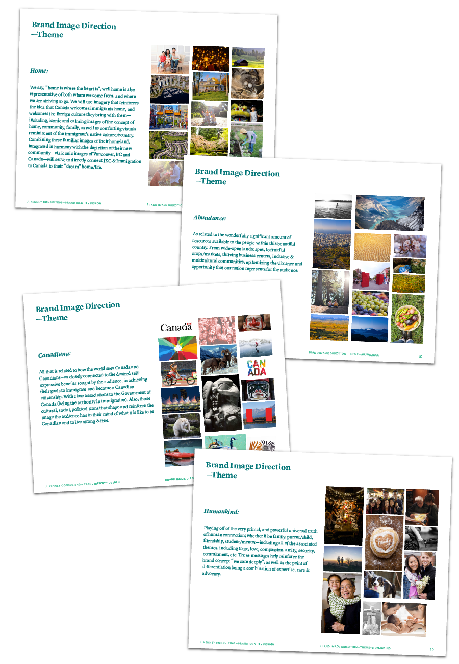


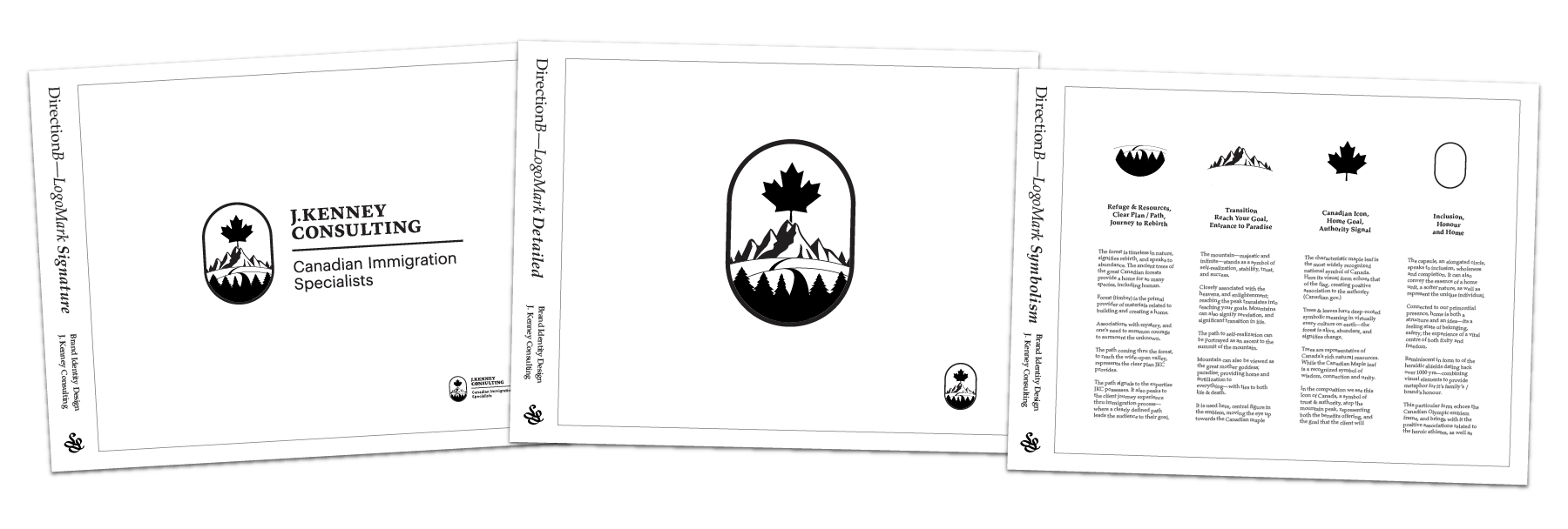
Brand LogoMark

Canadian Icon, Home Goal, Authority Signal.

Refuge & Resources, Clear Plan & Path — journey to Rebirth.

Transition. Reach Your Goal, Entrance to Paradise.

Secure Feeling. Inclusion, Honour and Home.
LogoMark Direction


Brand Signature w/ Tagline

Brand Colour

Vivid Peacock Green
CMYK: 70, 0, 55, 0RGB: 67, 183, 146HEX: #43B992PMS: 2240 C
This hue conveys a sharp, modern, Western image. Associated with being desirable and fashionable in Asian markets. When combined with cool colours, such as blues, the effect is agile, vigorous, active, bold and progressive.
Dull Shadow Green
CMYK: 100, 0, 40, 4 0RGB: 27, 103, 103HEX: #1B6767PMS: 8744 C
This subdued tone of grayish green, is quiet, sophisticated, and traditional. Naturally rational and sober in character, it conveys images that are precise and composed. When paired w/ bright colours, the impression is modern & reserved.
Light Silver Gray
CMYK: 5, 5, 5, 0RGB: 235, 234, 228HEX: #EBEAE4PMS: Cool Gray 1 C
Conveys the freshness of white, yet has a more noble and polished impression. Ideally combined with cool/soft hues, to create a reserved, refined and distinguished image. Has an intellectual, rational, calming and modern feel.
Pale Aqua Green
CMYK: 30, 0, 10, 0RGB: 184, 2 30, 230HEX: #B8E6E6PMS: 2225 C
This clear & refreshing colour appeals to both men and women, young and middle-aged. A naturally pure & simple image, when combined with cool/dark blues creates a calming, healthy, and peaceful touch. Associations to the West.
Bright Salvia Blue
CMYK: 30, 0, 10, 0RGB: 184, 2 30, 230HEX: #B8E6E6PMS: 2225 C
This bright & clean hue, has a smart, structured yet refreshing image (ties to West). The effect is youthful, pure & fresh; it’s stylishness is appealing. Projects a progressive image to inspires dreams for the future.
Dark Mineral Blue
CMYK: 100, 75, 15, 30RGB: 27, 54, 100HEX: #1B3664PMS: 654 C
Perceived by the general public as being more familiar that any other (aside from red & white). More supple & less formal, when compared to black—yet still has the characteristics of dynamism, sharpness and feeling of timelessness.


Positioning Statement
Target Audience
For those seeking to live, work or study in Canada in order to fulfill their personal and professional goals in an environment of freedom and opportunity,
Frame of Reference
J. Kenney Consulting, Canadian Immigration Specialists, lifts the burden of stress and uncertainty involved in obtaining permanent or temporary status in Canada.
Differentiation
We strive to treat each client’s case as if it were for a member of our own family and care deeply about obtaining the outcome you are seeking.
Reasons to Believe
Backed by decades of experience providing expert advice, counsel, representation and advocacy of behalf of many hundreds of successful clients. With prior experience working at both the provincial and federal levels in the immigration field, we provide a complete understanding and knowledge of the application process as it relates to an individual’s case, not only as consultants but also as educators and acknowledged leaders in our field.
Brand Website
Based on the brand roadmap & story, we had a good understanding of the structure and framework we would use for communicating the desired messages to the audiences.
— How can we design the information to be understood easily and clearly?— How will we organize the information for access, navigation, and search?— How do we present the thought-leadership and longer-form writing?— How can we organize the info in a logical manner, around user needs and journey?
I engaged Joe and his team in the copy-strategy, writing, and eventually the translation from english into Japanese and Mandarin. We managed and collaborated on the written content through Google Drive project folder. With the team on finalizing translation, i was able to work to develop a prototype of the site, to build out the information architecture, and apply the brand "look & feel".

Information Architecture:
We designed the structural of the critical information to be communicated, to ensure the messaging would be easily be received by the audience.We mapped-out the logical flow of the narrative through the website landing pages, sub-trees of navigation, as I worked to define the user's journey.The synthesis of information, organization, navigation, communication, and search. Shaping the service info and framing the experience for the user, it support of usability, scan-ability, find-ability, and comprehension.

